3 blocks can be created on the header of a front page
The height of the header can vary between 50%, 75% and 100%
Multiple images can be displayed manually or in autoplay modus

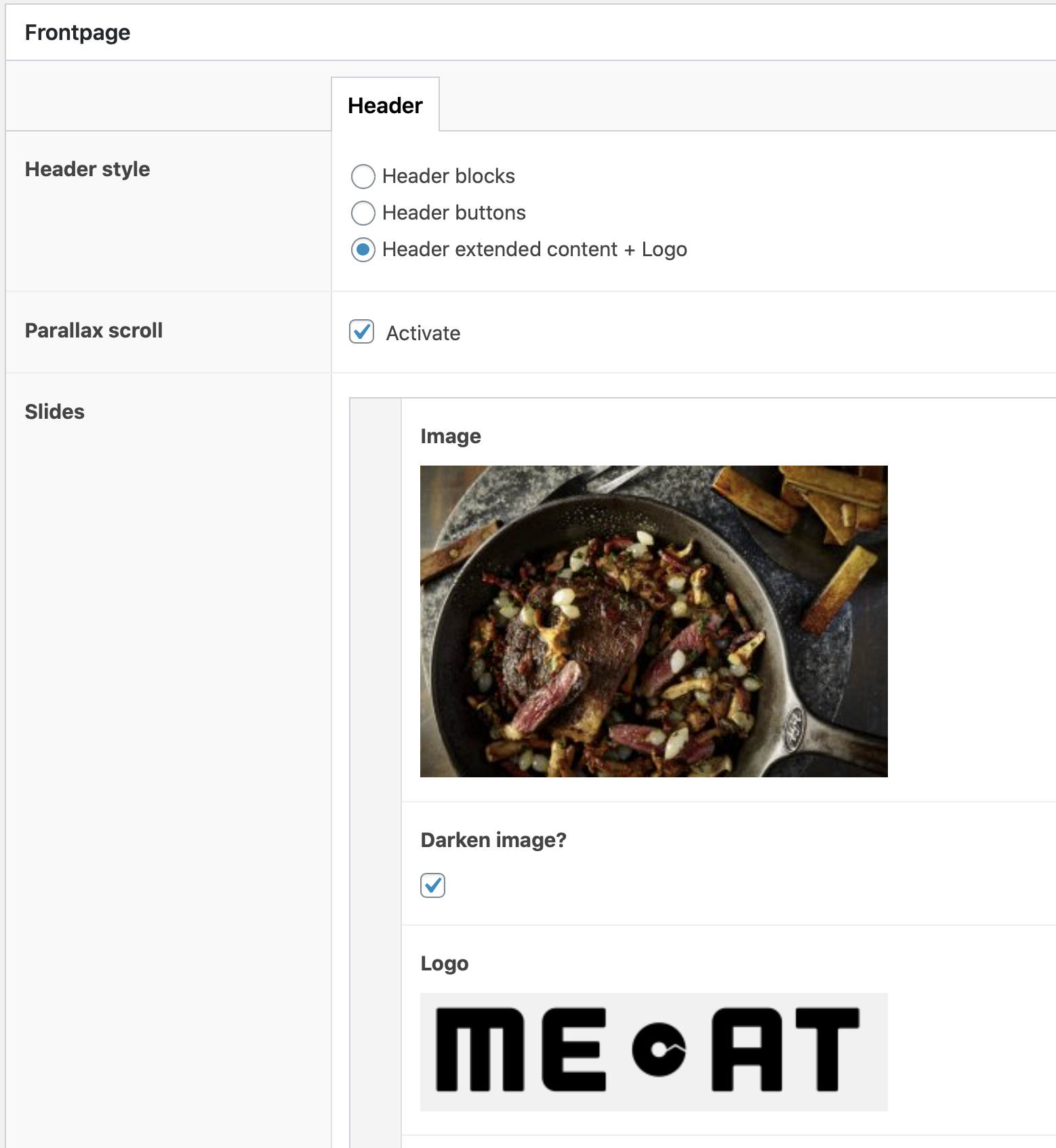
Header options
3 options can be chosen for the header:
- Header blocks: 3 blocks in the header / slider with title left or right and hyperlinks. This is only possible on the home page
- Header buttons: with navigation buttons one below the other, which refer to blocks within the website (green button) or external web addresses (blue button), as shown at the top of this page
- Header extended content + logo + max. 3 buttons next to each other

Manual navigation or autoplay
The height of the slider can be set to 50%, 75% or 100%.
Also a logo can be added in 3 different sizes: small, medium and large
Text block
By default, the text block is centered on the left, just like the title, and it covers 60% of the width. The Text container checkbox also offers the possibility to fill out the text across the entire width, as here. The background is white with black (dark gray) text by default, but the background color can be adjusted.
Text block with background colour
This is an example of a text block with 60% width and a background colour. Colours can only be chosen from the predetermined set of colours. A variation can however be made by changing the opacity of a colour to 80, 60, 40 or 20%.
Left column title
In a 2-columns block text can be place in the left and/or right column. The ration can be adjusted to 60-40%, 40-60% or 50-50%. The background colour is always white or light grey with dark grey text.
Several images can be added on top of each other. Below each image a caption can be written and also a link can be added.
At the left and right side a button, including text and a link can be added. If desired the link can be opened in the same or in a new browser window.

Right column title
Fold-outs can be added to the left and right column. In these fold-outs a choice can be made between content (text or image) or downloads. The fold-outs unfold by clicking on them.
A text can be added in a fold-out. This text appears when unfolding the fold-out.


Items block
An intro text can be placed above the items. A maximum of 12 items can be placed, all with a background colour or an image, as well as a header/title. For some colours the opacity can be adjusted, to create more colour variations. Furthermore, it is possible to make the items smaller in width and height.
Fields of Expertise block
-
Header 1
Here, a text can also be added
-
Header 2
Make sure the texts are equally long or else it might be awkward in design.
-
Header 3
To make sure that the headers are at the same height, please use the same amount of sentences for all columns. T
Anchors
With so-called anchors you can refer and link to specific blocks from another part of the website. Anchors always consist only of lowercase letters, numbers and all words are decided by hyphens, so other characters (such as an umlaut) are not possible. You can add anchors to almost any block. They appear at the bottom of these blocks.
this-is-an-example-of-an-anchor
When you want to link to this anchor from another page/block in the website this is done by using the pagename followed by a hashtag and the concerning anchor, like:
https://www.vion-transparency.com/example-page#this-is-an-example-of-an-anhor
1 of 2 videos block
Beneath the video a text can be placed. Furthermore, an image overlay can be placed instead to replace the original video still. Two videos can be placed next to each other, both with accompanying texts. The videos can be shown in full width or with margins left and right.
When only 1 video is shown, this video can be shown full width or constrained to a container. Again a text can be added beneath the video. Also a quote can be placed left or right of the video. This quote can also be combined with a text beneath the video.
Products block
In the products block 3 products can be selected.
At this moment only products from the existing products catalogue can be selected. In future it will be possible to add products to a local products catalogue that can then be displayed.
When selecting the products, make sure to pick the right language version of a product. In the product list all languages are shown in alphabetical order, which is confusing. This issue will also be solved in the near future.
Nieuwsblock

Nieuwsartikelen
Het nieuwsblok vertoont altijd de laatste 3 nieuwsartikelen van de betreffende website. De nieuwsartikelen worden aangemaakt onder het item ‘News’ in de zwarte balk links in het dashboard (zie afbeelding rechts). Bij de nieuwsartikelen zijn 5 blokken beschikbaar (text, text & image, image, social media en video) voor het samenstellen van een nieuwsbericht. Ook kunnen categorieën worden gedefinieerd om nieuwsberichten te kunnen rubriceren.
Hoofdkantoor
5281 RM Boxtel
Text block in kleur
Dit is een voorbeeld van een tekstblok in kleur, waarbij de tekst niet over de volledige lengte is uitgelijnd. Er kan worden gekozen uit de vast corporate kleuren van Vion. Bij websites met een eigen design wordt dit kleurenpallet aangepast naar de betreffende huisstijl. De ‘opacity’ staat standaard op 100% dekking, door dit percentage lager te maken wordt de betreffende kleur lichter.
Achtergrondverhalen
Dit is een voorbeeld van het block articles. Eerst moeten de artikelen worden aangemaakt. Dit kan door in het dashboard links voor Articles te kiezen en een nieuw artikel toe te voegen. De lay-out van deze articles is idem als bij de nieuwsberichten, waarbij gebruik kan worden gemaakt van 5 blokken: text, text & image, image, social media en video. In het blok Articles kies je vervolgens welke Articles getoond moeten worden op de pagina. Deze hebben automatisch een doorlink naar het betreffende Article.